Using Media With Purpose
Media should clarify, demonstrate, or reinforce a learning objective. Choose images, video, and audio when they help learners see a process, hear terminology, compare examples, or review information in a format that text alone cannot provide.
Media should be useful, accessible, and lightweight.
- Do not autoplay video or audio.
- Compress files before uploading.
- Use captions for video.
- Provide transcripts for audio.
- Use meaningful alt text for informative images.
- Mark decorative images with an empty alt attribute.
- Avoid using text embedded inside images when possible.
- Use responsive media containers.
- Test media on desktop and mobile.
Image Components
Use image components to present instructional visuals consistently across course pages, previews, and Brightspace content.
1. Standard Responsive Image
Purpose: Presents a single instructional image when nearby text already provides enough visible context.

Accessibility Note: Use alt text that communicates the instructional purpose of the image. A visible caption is optional when nearby text already provides adequate context; alt text is still required for an informative image.
2. Full-Width Content Image
Purpose: Gives detailed visuals enough horizontal space to remain readable.
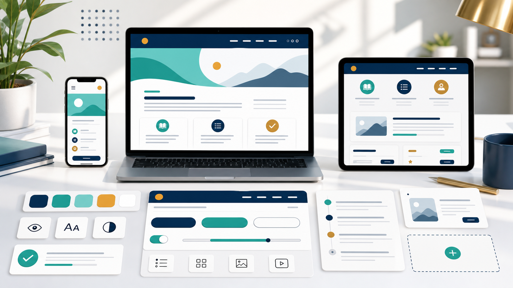
Accessibility Note: If the visual contains complex information, provide a nearby text summary or long description in addition to alt text.
3. Image Aligned Left
Purpose: Places a supporting image beside explanatory content without tight text wrapping.

Best Used For
Orientation reminders, short process introductions, and visual examples that should sit near a paragraph of explanation.
Usage Guidance
Keep the text concise and related to the image. On smaller screens, the image stacks above the text for readability.
Accessibility Note: Do not use alignment to imply reading order. The HTML order should still make sense when stacked on mobile or read by assistive technology.
4. Image Aligned Right
Purpose: Places a supporting image to the right of text while preserving readable spacing.

Best Used For
Short text blocks where the image reinforces the point but should not dominate the page.
Usage Guidance
Avoid pairing long paragraphs with aligned images. If the text is lengthy, use a standard image followed by the content instead.
Accessibility Note: The image and text stack cleanly on mobile, which supports zoom, narrow screens, and Brightspace content areas.
5. Image with Caption
Purpose: Uses semantic figure markup to connect an image with explanatory caption text.
Accessibility Note: Captions are visible to all learners and remain available in print.
6. Click-to-Zoom Image
Purpose: Opens a larger image view for diagrams or screenshots with small details.
Accessibility Note: Do not rely on hover. The modal prevents background scrolling while open and shows the zoom description in print.
7. Side-by-Side Images
Purpose: Compares two related visuals in a balanced layout.
Accessibility Note: Each image needs its own alt text and caption or label.
8. Image Grid
Purpose: Displays a small set of related visuals as a scannable group.



Accessibility Note: Use short labels with captions so the grid remains clear when images stack on mobile or print.
9. Image Gallery
Purpose: Lets learners review a small set of related images without autoplay or question behavior.
Accessibility Note: Gallery choices are buttons with selected states. Thumbnail images are decorative because the button labels and main image provide the accessible information.
10. Before-and-After Image Slider
Purpose: Compares two states with a keyboard-operable range control.
 After
After
Accessibility Note: The comparison does not rely on dragging alone. Keyboard users can adjust the range control with arrow keys.
Video Components
Use video components when motion, demonstration, or narrated visual explanation helps learners understand a concept or procedure.
11. Responsive Embedded Video
Purpose: Holds a 16:9 embedded video or placeholder without fixed dimensions.
Description: Short demonstration of greeting a patient, confirming information, and closing the conversation. Transcript: Transcript link or panel required near the video.
Accessibility Note: Embedded videos should not autoplay. Include a descriptive title on iframes when replacing this placeholder.
12. Native HTML5 Video
Purpose: Shows the standard HTML5 video pattern for local video files.
Accessibility Note: Controls must remain available to keyboard users. Captions should be included with a valid track file when final media is added.
13. Video with Transcript
Purpose: Pairs video with readable transcript content that does not require playback.
Transcript: Course Navigation Walkthrough
Opening: In this walkthrough, we will locate weekly modules, announcements, assignment instructions, and support resources.
Main steps: Start on the course home page, open the current week, review the overview, and confirm the required readings and submissions.
Closing: Before leaving the course, check announcements and note any due dates that should be added to your calendar.
Accessibility Note: Transcript content is real HTML text, printable, and readable without JavaScript or media playback.
14. Video Modal
Purpose: Opens focused video content in a reusable modal and stops media when closed.
Accessibility Note: The reusable modal prevents background scrolling while open and resets iframe sources when iframe video is used with data-src.
15. Video Playlist
Purpose: Lets learners choose one short video topic at a time.
Welcome to the Module
Introduces the module purpose, weekly outcomes, and where learners should begin.
Duration: 02:10
Accessibility Note: Playlist choices are buttons with selected states. Selecting a new item pauses and reloads the player without autoplay.
16. Video Preview Card
Purpose: Presents a video title, thumbnail, duration, captions indicator, and action button in one compact card.
Professional Phone Etiquette
Demonstrates how to answer a workplace call, confirm the caller's need, and close with a clear next step.
Duration: 05:20 | Captions: Required
Accessibility Note: The button label describes the action. Avoid icon-only controls unless an accessible name is present.
Audio Components
Use audio components when listening supports pronunciation, professional communication, interviews, or short narrated explanations.
17. Standard Audio Player
Purpose: Presents one audio clip with title, duration, description, and transcript access.
Instructor Welcome Message
A brief welcome message outlining how to approach the first week of the course.
Duration: 01:45
Accessibility Note: Do not autoplay audio. Provide a transcript for learners who cannot hear or who prefer to read.
18. Audio with Transcript
Purpose: Keeps the complete spoken content available as readable text.
Transcript: Preparing for a Skills Lab
Before attending skills lab, review the procedure steps, gather any required materials, and write down questions you want to ask your instructor.
During practice, focus on accuracy first. Speed develops after the steps become familiar and consistent.
Accessibility Note: Transcript text remains visible in print and does not depend on JavaScript.
19. Podcast-Style Audio Card
Purpose: Packages a longer narrated audio item with artwork, summary, player, and transcript link.
Professional Communication Minute
Episode summary: A short discussion of how to write concise messages when asking for support in a course or workplace setting.
Duration: 06:15
Transcript Summary
This episode explains how to include context, action needed, deadline, and a courteous closing when sending professional messages.
Accessibility Note: Podcast-style cards should not hide the transcript behind a media-only experience.
20. Pronunciation Audio
Purpose: Provides a compact pronunciation reference for medical or technical terminology.
Auscultation
Phonetic spelling: aw-skul-TAY-shun
Written pronunciation: Listen for emphasis on the third syllable.
Accessibility Note: The written pronunciation supports learners who cannot play or hear the audio.
21. Audio Playlist
Purpose: Groups several short audio clips while ensuring only one clip plays at a time.
Greeting a Patient
Short example of a professional opening statement.
Duration: 00:35
Clarifying a Request
Short example of asking a follow-up question respectfully.
Duration: 00:42
Closing the Conversation
Short example of confirming the next step before ending a call.
Duration: 00:38
Accessibility Note: The shared media behavior pauses other audio or video when a new clip begins, preventing overlapping playback.
Recommended Media Sizes
Use these as source-file starting dimensions. Display sizes should remain responsive inside the course page.
| Media Type | Recommended Source Size | Guidance |
|---|---|---|
| Page header or wide banner image | 1600 × 500 px | Use only when the image supports the page identity and does not contain essential text. |
| Wide instructional image | 1200 × 675 px | Good for 16:9 diagrams, process visuals, and video thumbnails. |
| Standard content image | 900 × 600 px | Use for most figures placed inside the reading column. |
| Square instructional image | 800 × 800 px | Use for icons, object photos, and balanced cards. |
| Side-by-side image | 700 × 500 px each | Keep both visuals similar in crop and detail level. |
| Gallery thumbnail | 400 × 300 px | Use consistent aspect ratios to prevent layout shifts. |
| Video thumbnail | 1280 × 720 px | Use a 16:9 thumbnail that previews the actual video topic. |
| Podcast artwork | 800 × 800 px | Use square artwork and keep essential text out of the image. |
| Icons | SVG preferred | Use SVG for simple illustrations and icons when possible. |
Recommended source dimensions are not fixed display sizes.
- Images should display responsively.
- Do not upscale small images.
- Use aspect ratios consistently.
- Export images close to the largest dimensions shown in the table instead of uploading oversized camera originals.
- Compress images before use and remove unnecessary metadata.
- Aim for 500 KB or less for a typical instructional image when quality permits; detailed diagrams may need more, but should still be optimized.
- Prefer SVG for icons and simple illustrations.
- Prefer WebP or optimized JPG for photographs when supported.
- Prefer PNG for transparency.
- Avoid unnecessarily large source images because they increase download time, use more mobile data, and delay page rendering without improving the displayed result.
- For large images below the first screen, use native lazy loading when supported and include intrinsic width and height to reduce layout shifts.
Media Accessibility
Accessible media gives learners equivalent access to the same instructional information, regardless of device, modality, or assistive technology.
Accessibility Checklist
Use this checklist before publishing media inside Brightspace.
- Informative image alt text: Describe the instructional information, such as "Blood pressure cuff positioned on the upper arm before inflation."
- Decorative image: Use an empty alt attribute, such as
alt="", when the image adds no instructional meaning. - Captions and alt text: Captions are visible context for everyone; alt text is the concise text alternative announced in place of an image. Do not copy the same wording into both.
- Captions for video: Provide synchronized captions for spoken content and meaningful sound cues.
- Transcript for video: Include a readable transcript that identifies speakers and important visual context.
- Transcript for audio: Provide the full spoken content as nearby text or a clearly labeled transcript link.
- Audio description consideration: Add visual descriptions when important video information is not conveyed by narration.
- Avoid text-only information inside images: Put essential text in HTML so it can resize, translate, and be read by assistive technology.
- Keyboard access: Media controls, galleries, modals, and playlists must work without a mouse.
- Visible focus: Check that every interactive control has an obvious focus indicator when navigating with Tab and Shift+Tab.
- Color: Do not use color alone to communicate status, selection, instructions, or meaning; pair it with text, shape, or another visible cue.
- No autoplay: Learners should decide when video or audio begins.
- No flashing or rapid animation: Avoid visual effects that can distract or create health risks.
- Clear link wording: Name the destination or action, such as "Open larger cell diagram" or "Read transcript," and avoid vague wording such as "click here."
- External links: Open links in the same tab by default. If a new tab is necessary, tell learners in the link text or nearby instructions.
- Interaction instructions: Before an interactive component, briefly explain what to select and what will change; include keyboard directions when the interaction is not obvious.
Media Placeholders
Use placeholders while building course pages before final images, video, or audio files are ready.
Image Placeholder
- Recommended dimensions: 900 x 600 px
- Alt text field required
- Caption field recommended
- Asset status: awaiting final image
Video Placeholder
- Recommended length: 2 to 6 minutes
- Captions required
- Transcript required
- Thumbnail required
- Asset status: awaiting final embed or file
Audio Placeholder
- Transcript required
- Duration: add final runtime
- Speaker or narrator: identify when relevant
- Asset status: awaiting final audio
 Brightspace Note
Placeholders should be replaced before a course is released. If a placeholder remains during review, include a clear asset status so reviewers know what is missing.